
A Multi-Modal Project: The Breakdown

For the third writing project in my ePortfolio, I will be breaking down the process of how I created this website using WIX. Getting to know and understand the WIX website was very challenging in the beginning. However, as I began to gain more experience with the tools and mechanics of it all, navigating the website became almost like second nature.
The first obstacle to tackle was how to begin my WIX page and to start, I went with the Demi Watson interior design template. This template was perfect for the design and layout that I wanted for my website and for those viewing it, as well as functional and appropriate for the format required for this course.
My home page is where it all begins. My vision was to create a very small personal moment at the very top that included a picture of myself and an introduction to my website and its purpose. I decided against an "About Me" section as I didn't want to really go into depth about who I am, but just to keep most of the focus on the project and how it developed me as a writer. However, I did include a small paragraph to show some of my background so that viewers could still get a glimpse of me as a person. My home page also includes a small snippet of each tab in my website, which makes it easier to jump to a certain page and also allows for them to know and anticipate what each tab is going to be about. From the home page, one can then click over to the film review. Here is where I present my own opinion on what the Documentary Heal was like for me. This page will help lead right into my immersion experience, as I take on the approach of what was learned as I watched the film and incorporated it into my own life. Once viewers have reached this section of my website, they will come to find an overview of this entire webpage and how I was able to make it into what it currently is. Finally, my last tab is composed of a reflection on this course, the assignments, the projects, etc., and how it has grown me into a better and more knowledgeable writer this semester. Each tab will include the use of hyperlinks, which were used on my homepage to take viewers to different tabs within my website and also used throughout my writing to take viewers to other web pages that show where I found my resources, other web pages to help explain concepts and show context, etc. Images were also used in each tab to help enhance reader likability and also to provide a much nicer read of the entire website. Visuals really help to make things much more enjoyable and add credibility and creativity. This also plays into how I incorporated colors to appeal to the eye and were visually pleasing.
"This concept encompasses the ability of a person to culminate their own perspective, ideas, and experiences into a mode that can be shared with others."
"The goal was to create a website that showcased my pieces in an easy, smooth, connected space."
In complete transparency, it was a challenge to make this website user friendly through imagery, colors, hyperlinks, and other visuals. One very important concept that was used to help me overcome this challenge and develop the ideal website is known as Folio thinking. This concept encompasses the ability of a person to culminate their own perspective, ideas, and experiences into a mode that can be shared with others. This very website is the product of my own display of folio thinking and is how I was able to make sure decisions on colors, the use of certain images, and overall how to portray my work in this kind of setting (online). The goal was to create a website that showcased my pieces in an easy, smooth, connected space. I wanted each tab to have its own theme as it pertained to the writing that is featured there, while all having a similar theme overall. This drove me to experiment with several different background colors, several font types, and positioning of paragraphs, images, and pull-out quotes. As I began to set a more concrete image of what I wanted for the entire website, I decided to give each tab a sort of identity through the colors and placing of everything on the page. I wanted each one to be unique, but also for the entire website to flow and be simple to follow.
In the end, I was finally able to procure this website to my ultimate liking and meet the objectives established in the course. From the very beginning of this website, viewers will be able to have a firsthand look into my journey through the workings of WIX and how it gave me an amazing platform to create and share my experiences in this course.
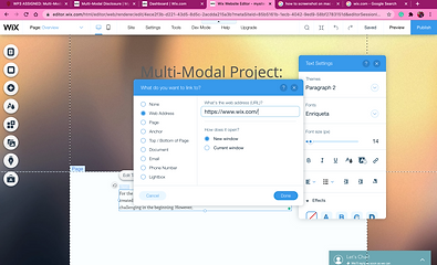
A screenshot of my in-process editing of this tab on my website. Also shows how to create a hyperlink within your paragraphs.

Another in-process screenshot of my film review tab. This picture shows how I hadn't yet created an aesthetically appealing layout for the paragraphs yet. Everything was very uniform and not very friendly to read.